- IELTS WRITING TASK 1 -LINE GRAPH & BAR CHART
Coffee Shop Sales Comparison and Coffee Preferences (2022)
You should spend about 20 minutes on this task.
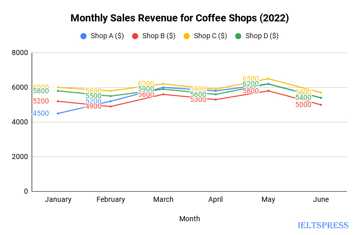
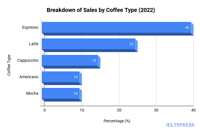
Task: The given data presents the sales performance of four different coffee shops over a period of six months. The line chart illustrates the monthly sales revenue in dollars for each coffee shop, while the accompanying bar chart showcases the distribution of sales by coffee type across all coffee shops. Summarize the trends and key observations from the line chart and bar chart.
Write at least 150 words describing the main trends and comparisons shown in the graphs.


Sample Answer, C1 English Level, Advanced, Band Score 6.5-7.5
The graphs present data about sales from four different coffee shops over six months in 2022. The line graph illustrates the amount of money each shop earned per month, while the bar chart shows what percentage of sales came from different types of coffee.
Regarding the line graph, Shop C consistently had the highest sales throughout the period, while Shop B had the lowest. Shop A’s sales fluctuated, and Shop D’s sales were relatively stable. Sales for all shops generally increased, with some fluctuations, from January to May, before a slight drop in June.
For the bar chart, the majority of sales came from espresso and latte, contributing 40% and 25% respectively. Cappuccino, Americano, and mocha made up the rest, each around 10-15%. This suggests that customers preferred the more traditional coffee choices. In conclusion, the line graph and bar chart provide a clear picture of how the four coffee shops performed and what types of coffee were most popular.
The graphs depict sales data from four different coffee shops over a span of six months in 2022. The line graph showcases the monthly earnings of each shop, while the bar chart outlines the proportion of sales attributed to various coffee types.
From the line graph, it’s clear that Shop C consistently outperformed the others in terms of sales throughout the six months. Shop A’s sales experienced fluctuations, whereas Shop D maintained a relatively steady level. Shop B, however, demonstrated the lowest sales among all four. There was a general upward trend in sales for all shops from January to May, followed by a slight decline in June.
Turning to the bar chart, it’s evident that espresso and latte were the most favored choices, accounting for 40% and 25% of sales respectively. Cappuccino, Americano, and mocha each contributed around 10-15% to the total sales. This indicates that customers leaned towards traditional coffee options rather than the other varieties.
In conclusion, the line graph and bar chart collectively provide valuable insights into the sales performance of the coffee shops and the coffee preferences of customers during the year 2022.
The provided graphs showcase sales data from four distinct coffee shops over a duration of six months in 2022. The line graph offers a glimpse into the monthly revenue generated by each shop, while the accompanying bar chart presents the distribution of sales across various coffee types.
From the line graph, we can discern that Shop C consistently led in terms of sales over the entire period, exhibiting remarkable performance. Shop A experienced fluctuations, Shop D maintained relatively steady sales, and Shop B recorded the lowest sales. The overall sales trend indicates an ascent from January to May, followed by a slight dip in June.
Turning our attention to the bar chart, we note that espresso and latte were the preferred choices, accounting for 40% and 25% of total sales respectively. On the other hand, cappuccino, Americano, and mocha constituted around 10-15% each. This data signifies a preference for classic coffee options among patrons.
In conclusion, these graphs provide a comprehensive overview of the coffee shops’ sales dynamics and customer preferences throughout 2022. Shop performance variations and coffee type distribution insights emerge clearly, contributing to a deeper understanding of the presented data.

