- IELTS WRITING TASK 1
Distribution of Students’ Favorite Subjects
You should spend about 20 minutes on this task.
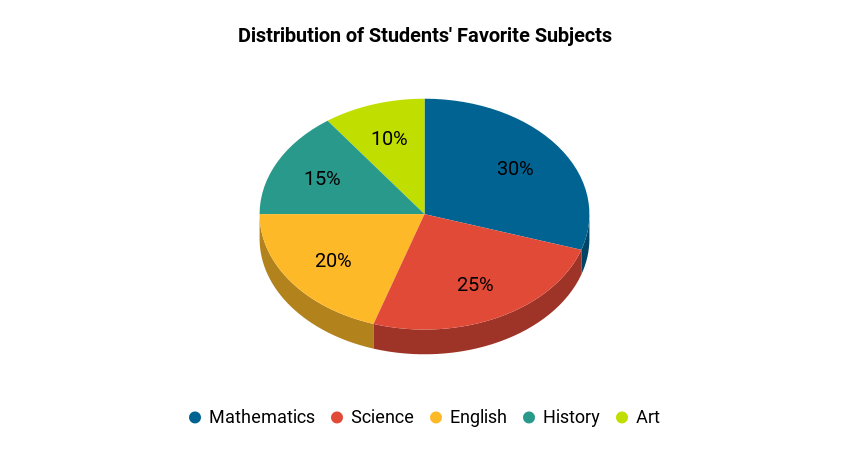
The chart below provides information about the distribution of students’ favorite subjects in a school.
Write a report of at least 150 words describing the information shown in the chart. Analyze the distribution of students’ favorite subjects and discuss any patterns or trends that emerge.

Sample Answer, C1 English Level, Advanced, Band Score 6.5-7.5
The provided chart illustrates the preferred subjects of students in a school based on percentages. Mathematics stands out as the most favored subject, with 30% of students selecting it as their favorite. Science follows closely behind, garnering the preference of 25% of students. English holds the third position, with 20% of students having it as their favorite subject. History captures the interest of 15% of students, while Art is favored by 10% of them.
From the chart, it is evident that there is a varied distribution of favorite subjects among the students. Mathematics and Science appear to be the most popular choices, with a combined preference of 55%. This might suggest an inclination towards quantitative and scientific subjects. On the other hand, the humanities subjects like English, History, and Art are preferred by a smaller percentage of students, hinting at differing interests among the student body.
In conclusion, the chart displays the diversity in students’ favorite subjects, with Mathematics and Science leading the way. This highlights the individuality of students’ academic preferences and underlines the importance of offering a balanced curriculum that caters to various interests.
Essay:
The chart provides insights into the favorite subjects of students in a school, presented as percentages. Among the subjects, Mathematics holds the top spot, with 30% of students selecting it as their favorite. Science follows closely with 25%, while English is favored by 20% of students. History and Art complete the list, being the favorite subjects of 15% and 10% of students respectively.
From the chart, we can observe that Mathematics and Science are the most popular subjects, making up more than half of the preferences. This suggests a strong interest in these fields, which involve logic and exploration. On the other hand, subjects like English, History, and Art are less favored, possibly due to their more subjective nature.
In summary, the chart illustrates that students in the school have diverse preferences when it comes to subjects. While Mathematics and Science seem to be the frontrunners, there is still a notable interest in humanities-related subjects. This showcases the varying interests and strengths of students and highlights the importance of providing a balanced education.
Essay:
The presented chart offers an overview of students’ preferred subjects in a school, expressed as percentages. Mathematics emerges as the most favored subject, with 30% of students indicating it as their favorite. Science follows closely behind, garnering the preference of 25% of students. English ranks third, with 20% of students selecting it as their preferred subject. History and Art occupy the final spots, capturing the interest of 15% and 10% of students, respectively.
Evidently, Mathematics and Science dominate the preferences, collectively representing more than half of the student body. This points to a strong inclination towards logical and analytical subjects. Conversely, English, History, and Art garner relatively fewer preferences, possibly due to their subjective and creative nature.
In conclusion, the chart showcases the diverse spectrum of students’ preferences, highlighting Mathematics and Science as the frontrunners. This underscores the individuality of interests and underscores the importance of a comprehensive curriculum that caters to various academic inclinations.

